5 tips on barcode colours
The barcode is the most important part of the packaging as it allows for automatic identification (AutoID) and recording data about the product. You can spice up such an important part of the packaging with colour, but beware… some colour combinations affect the readability of a barcode.
Bad colour combinations can result in errors when scanning. These are not only annoying during scanning. They also slow down processes, cause correction costs and problems in the supply chain. That is why you need to print a good barcode and use the right colour combination.


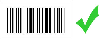
Best practice: black on white barcodes
Barcode scanners require a certain amount of light/dark contrast between the bars and gaps of barcodes so that their sensors can optimally detect and evaluate the reflected light.
The reflection difference between light and dark elements is called Print Contrast Signal (PCS). If you don’t want to take any risks with the scanability, make sure it is not lower than 80 %.
Black and white makes for the highest contrast. Therefore, it is the most reliable and common combination for industrial markings, such as those made with barcode labels. They are usually produced via so-called thermal printing methods and include barcode labels, GS1-labeling and LPN-labeling.
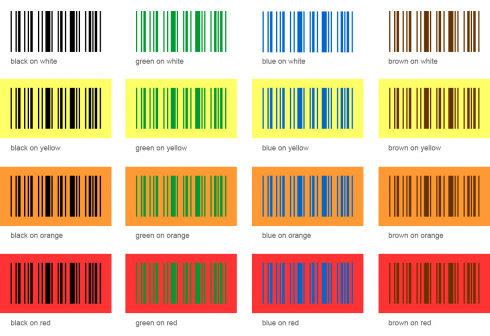
The right barcode colour match
The rule is quite easy: always put dark colours on light backgrounds.
These are the right colour combinations for a barcode.
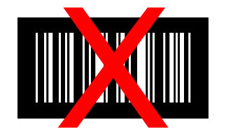
Bad colour combinations for barcodes
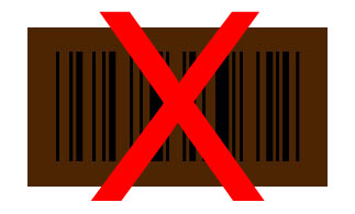
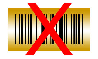
Light on dark
Barcode colours must not be reversed! If the background is dark and cannot be changed or covered, there is a trick: Print white spaces instead of black bars!
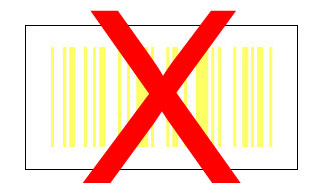
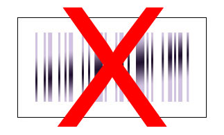
Light / light & dark / dark
Light stripes on a light background or dark stripes on a dark background are unsuitable because the contrast between the colors is usually insufficient for scanners.
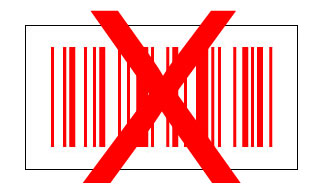
Red / white
Barcode scanners use red light or infrared light. This creates reflection on red surfaces, which are then interpreted as white. If the background is then light, there is insufficient contrast. Other shades with a high red, pink or orange content are also not suitable in combination with light colours.
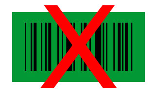
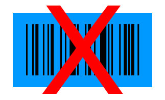
Green / black & blue / black
Because green is the complementary colour to red, green also has a drawback with barcodes. Green swallows the scanner’s red light and is then interpreted as black. Similarly, turquoise and blue shades do not make a good team with dark colours either.
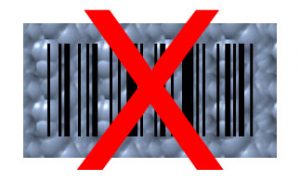
Metallic colours
Shiny metallic colours and shimmering effects are problematic because they can reflect too much light. As a result, the barcode scanner can no longer distinguish between bars and white spaces.
Patterns / transparency
It is probably already clear that patterned backgrounds are not suitable for reliable barcodes. The same applies to transparent surfaces that let the dark contents of the package shine through, which can reduce contrast.
Colored alternatives to conventional barcodes
Data matrix codes for greater design freedom
Conventional barcodes are known as one-dimensional barcodes. Data matrix codes, on the other hand, are two-dimensional barcodes that offer a few more advantages. Because they only require a contrast of 20%, they offer more design options. They also require less space and can therefore be integrated even more discreetly into the packaging design.
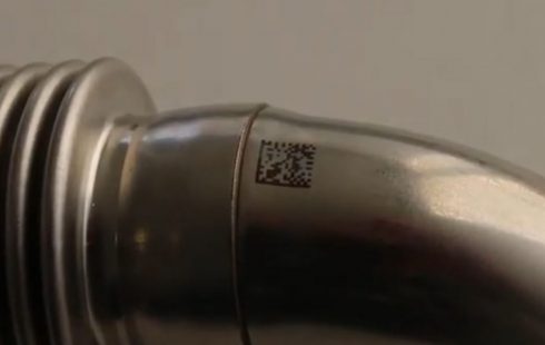
Small data matrix code on a metal component
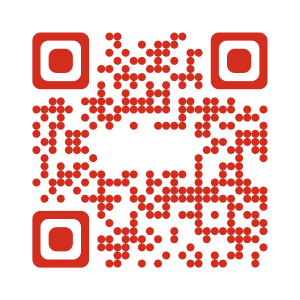
Colored QR codes as eye-catchers
Another type of two-dimensional barcode is the QR code. Nowadays, it can be found on many types of packaging, where it is intended to provide consumers with additional information and brand experiences via their smartphone cameras. The QR code is very similar to the Data Matrix code, but the two 2D codes differ in a number of ways.
In fact, there are several variants of colorful QR codes, including some lesser-known ones. With the so-called designer QR code, you can use colors in a particularly creative way. It is even possible to change the elements and use many colors at the same time. Logos and other advertising motifs can also be placed in them. However, this type of code is not suitable for most industrial applications as it does not comply with ISO standards.
Red designer QR code with Bluhm logo
JAB Code: Colorful barcode for large amounts of data
The innovative JAB code, also a two-dimensional barcode, was developed by the Fraunhofer Institute for Secure Information Technology SIT. It can use up to eight colors, which means that it can encrypt at least three times as much data as QR codes of the same size. By 2022, it is expected to be DIN-standardized and established as an international ISO standard (ISO 23634). This would make it interesting for industrial applications as well.
JAB Code: Colorful QR code for large amounts of data
Test barcode quality and follow guidelines
When designing barcodes, there is a lot to consider. In some cases, legislators or business partners specify guidelines for product labeling. Incorrect marking could even lead to recalls.
All barcodes used along the supply chain should therefore be thoroughly checked for quality in accordance with defined standards (see ISO/IEC 15416). Many manufacturers install appropriate verification systems in their production lines.
Whether it is label printers, labeling machines or inkjet printers for industrial barcode applications, always look for a reliable partner who will look at your process and work with you to come up with the right solution. Only then can you be sure that your products are properly traceable and that you never get hassle with wrong barcode colours!
Weber Labeling & Coding has more than 50 years of experience in the field of barcodes. The Weber team is always ready for advice and likes to think along with you.
